
- Length & ratio
- 3:43
- 16:9
More videos like this
View all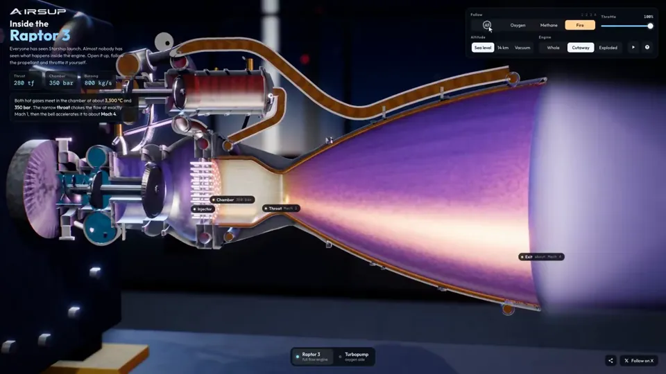
Explainer
Raptor 3 engine cutaway tracing its turbopumps
three.js, Shader · 16:9 · 0:35
by konstantinsaifo


Choose Your Plan
One balance of credits for AI videos and AI images. Subscribe monthly or yearly, or buy a credit pack once.
2,000 credits
$20one-time
Pay once · no subscription
Videos per pack
30-second product demo13 videos
60-second explainer5 videos
- 2,000 credits, added once
- Up to 86 fast images
- No added Potto watermark
- Shared by video and image tools
5,000 credits
$50one-time
Pay once · no subscription
Videos per pack
30-second product demo33 videos
60-second explainer13 videos
- 5,000 credits, added once
- Up to 217 fast images
- No added Potto watermark
- Shared by video and image tools
15,000 credits
$100one-time
Pay once · no subscription
Videos per pack
30-second product demo100 videos
60-second explainer40 videos
- 15,000 credits, added once
- Up to 652 fast images
- No added Potto watermark
- Shared by video and image tools
Lite
Choose Lite$20/monthBilled monthly
Videos per month
30-second product demo13 videos60-second explainer5 videos- 2,000 credits per month
- Up to 86 fast images
- Standard queue
- No added Potto watermark
- Batch processing with AI tools
- Not listed in public galleries
Pro
Choose Pro$50/monthBilled monthly
Videos per month
30-second product demo33 videos60-second explainer13 videos- 5,000 credits per month
- Up to 217 fast images
- Priority queue
- No added Potto watermark
- Batch processing with AI tools
- Not listed in public galleries
- Recommended
Max
Choose Max$100/monthBilled monthly
Videos per month
30-second product demo100 videos60-second explainer40 videos- 15,000 credits per month
- Up to 652 fast images
- Highest priority queue
- No added Potto watermark
- Batch processing with AI tools
- Not listed in public galleries
Lite
-20%Choose Lite$20$16/monthBilled annually · $240 → $192/year
Videos per month
30-second product demo13 videos60-second explainer5 videos- 2,000 credits per month
- Up to 86 fast images
- Standard queue
- No added Potto watermark
- Batch processing with AI tools
- Not listed in public galleries
Pro
-20%Choose Pro$50$40/monthBilled annually · $600 → $480/year
Videos per month
30-second product demo33 videos60-second explainer13 videos- 5,000 credits per month
- Up to 217 fast images
- Priority queue
- No added Potto watermark
- Batch processing with AI tools
- Not listed in public galleries
- Recommended
Max
-20%Choose Max$100$80/monthBilled annually · $1,200 → $960/year
Videos per month
30-second product demo100 videos60-second explainer40 videos- 15,000 credits per month
- Up to 652 fast images
- Highest priority queue
- No added Potto watermark
- Batch processing with AI tools
- Not listed in public galleries
Videos use credits when you export, and starting one needs a balance that covers its export. Counts assume a 30-second product demo and a 60-second explainer with narration and 3 illustrations.
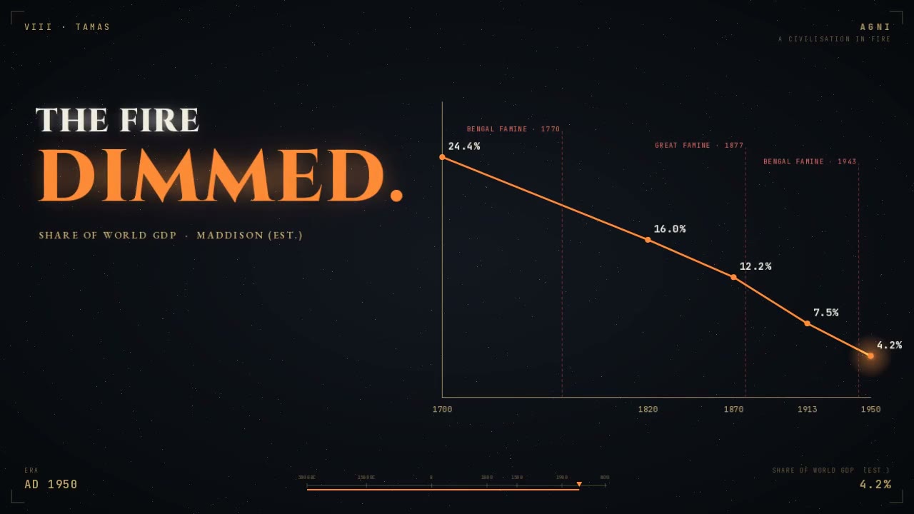
Chart of India's falling GDP share in a 5,000-year history FAQ
How Chart of India's falling GDP share in a 5,000-year history was made, what its prompt says, and how to make Explainer videos like it with Potto.
What is Chart of India's falling GDP share in a 5,000-year history?
Chart of India's falling GDP share in a 5,000-year history is a motion graphics video by HindolSengupta in the Explainer collection. An explainer video charting India's share of global GDP across 5,000 years.
How was Chart of India's falling GDP share in a 5,000-year history made?
The creator of Chart of India's falling GDP share in a 5,000-year history did not list the tools behind it. It is part of the Explainer collection of AI motion graphics videos on Potto.
Is the prompt for Chart of India's falling GDP share in a 5,000-year history available?
The creator did not share the prompt behind Chart of India's falling GDP share in a 5,000-year history. You can still describe a similar Explainer video in the Potto workspace.
How long is Chart of India's falling GDP share in a 5,000-year history, and what is its aspect ratio?
Chart of India's falling GDP share in a 5,000-year history runs 3:43 in a 16:9 frame.
Can I make Explainer videos like Chart of India's falling GDP share in a 5,000-year history with Potto?
Yes. Describe a Explainer video like Chart of India's falling GDP share in a 5,000-year history in the Potto workspace. Potto renders its own version, and you can change the text and style before you export.
Where can I watch the original Chart of India's falling GDP share in a 5,000-year history?
Chart of India's falling GDP share in a 5,000-year history was first posted by its creator. Click View original to open that post in a new tab.
Where can I find more Explainer videos like Chart of India's falling GDP share in a 5,000-year history?
Browse the Explainer collection on Potto: 264 videos, each with its prompt, specs and source.