Data Story
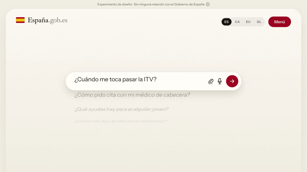
Spanish public services portal concept with a dot map of town halls
16:9 · 0:50
by jgarcelan
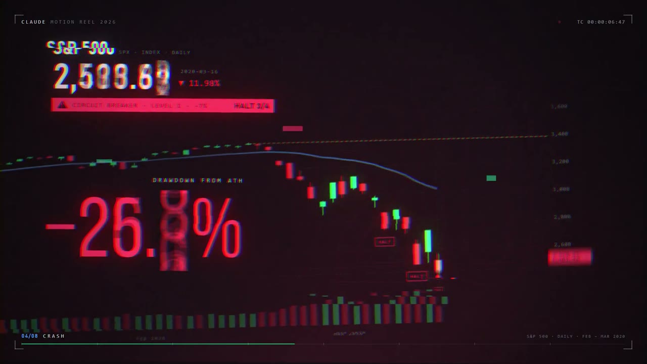
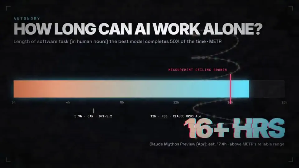
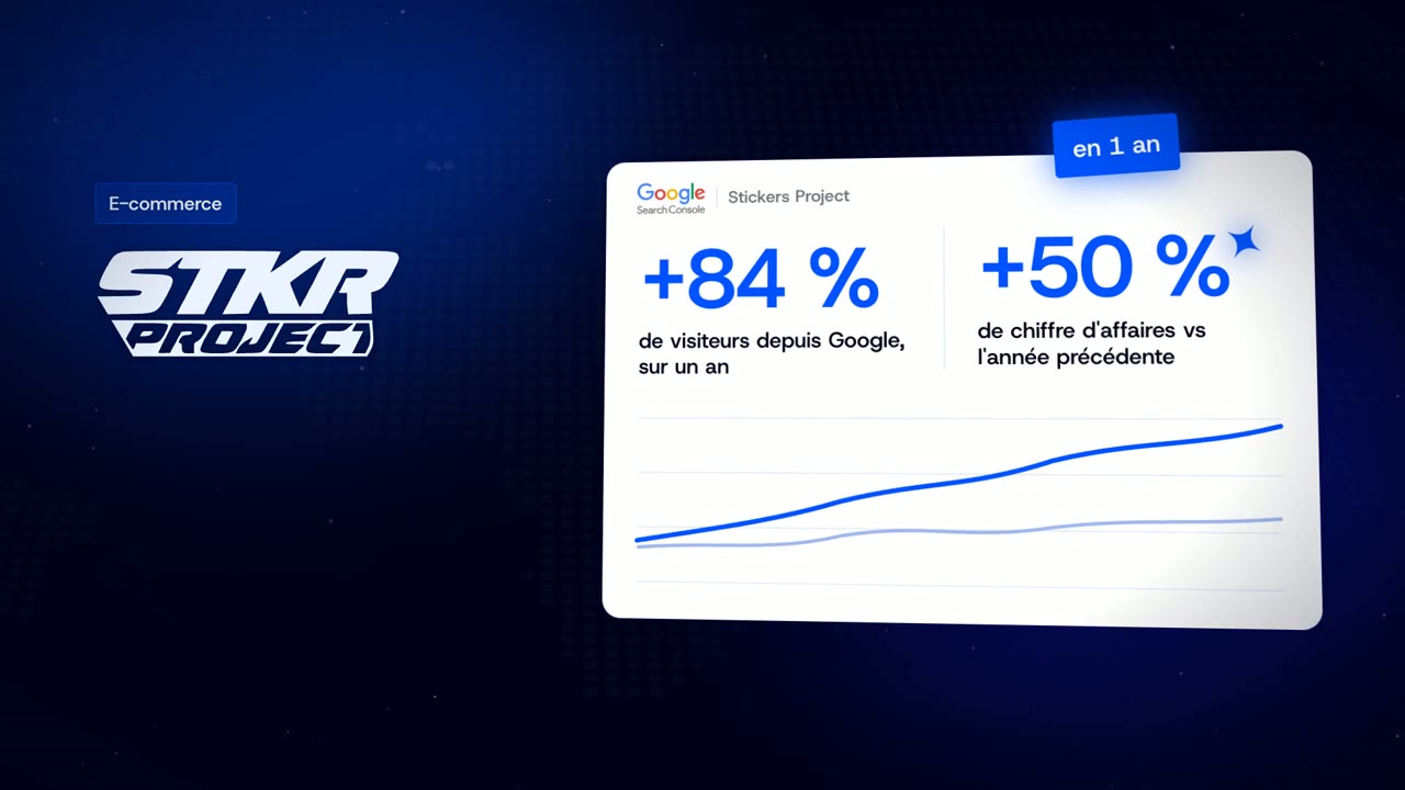
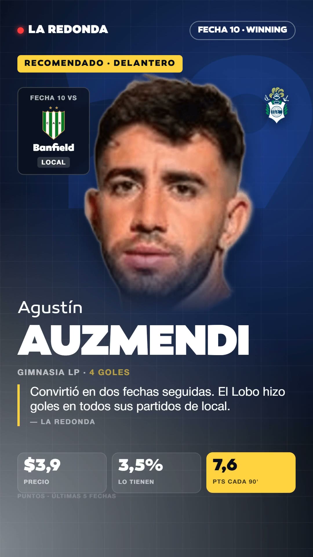
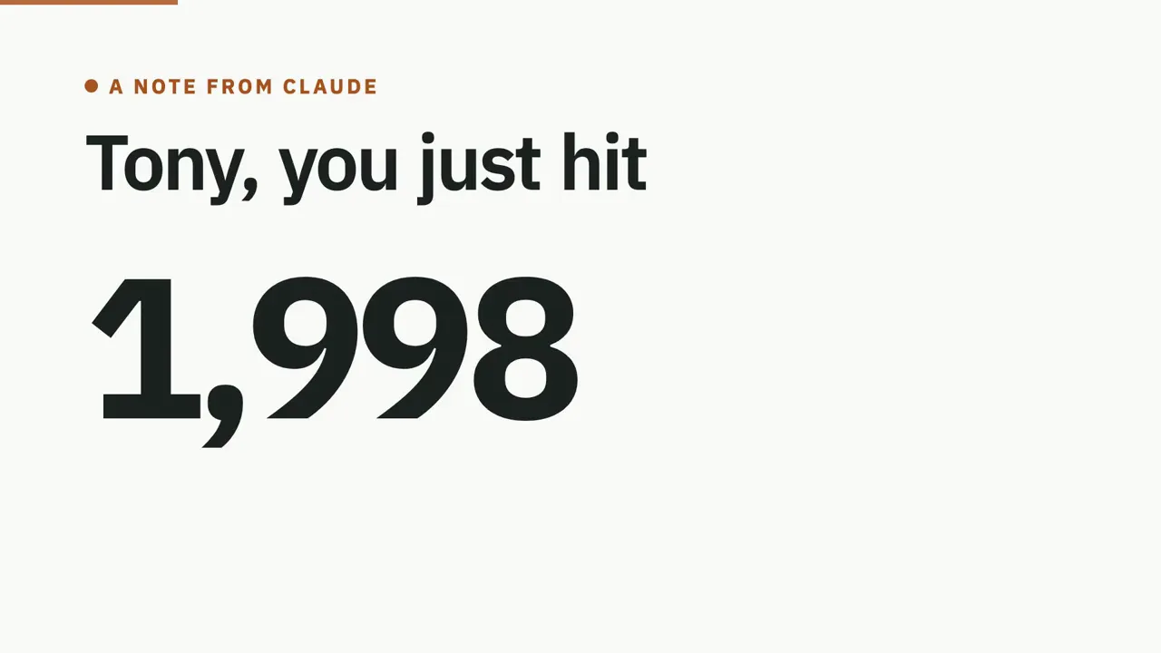
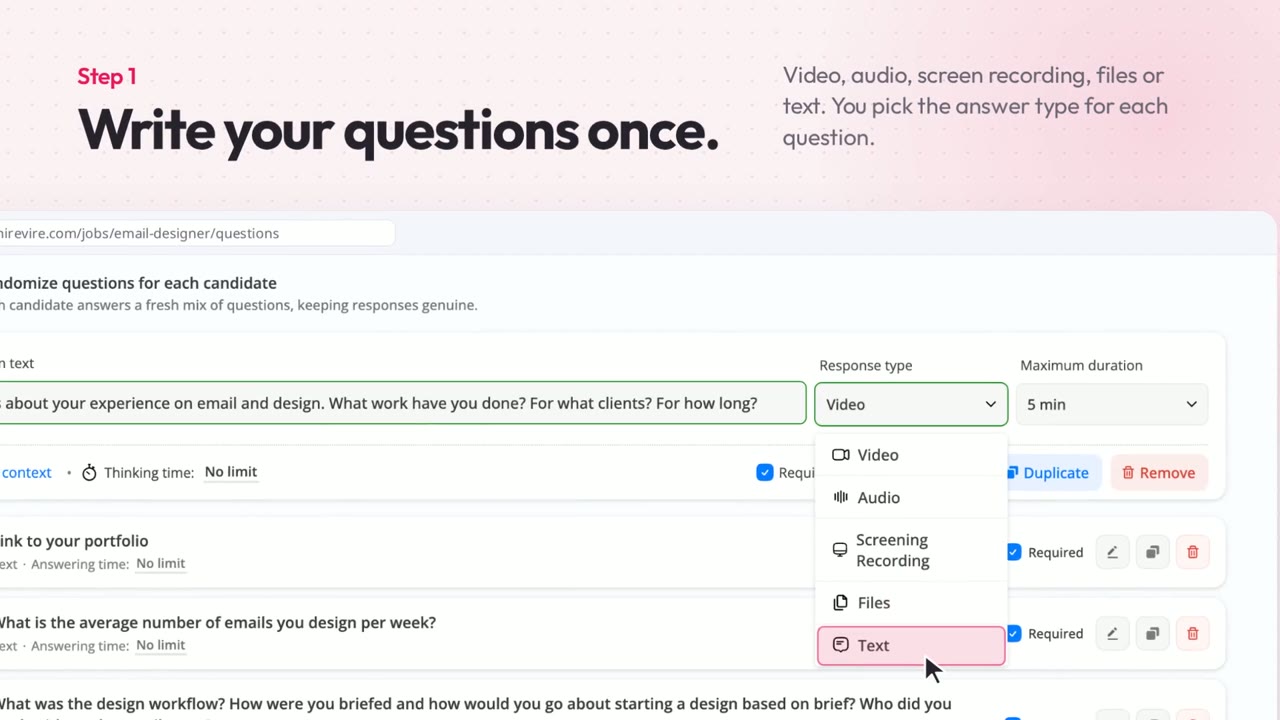
Turn a few numbers into short data storytelling: a title that asks the question, a chart that counts up and the stat that answers it, with a voiceover and captions. Start from a creator’s prompt or your own numbers and export an MP4.
26 works
Data Story
16:9 · 0:50
by jgarcelan









Data Story
Canvas, Audio · 16:9 · 3:00
by GroundControl

Choose a plan to make your own motion graphics with Potto.
Pay once · no subscription
Videos per pack
Pay once · no subscription
Videos per pack
Pay once · no subscription
Videos per pack
Billed monthly
Videos per month
Billed monthly
Videos per month
Billed monthly
Videos per month
Billed annually · $240 → $192/year
Videos per month
Billed annually · $600 → $480/year
Videos per month
Billed annually · $1,200 → $960/year
Videos per month
Videos use credits when you export, and starting one needs a balance that covers its export. Counts assume a 30-second product demo and a 60-second explainer with narration and 3 illustrations.
Data storytelling is the practice of presenting data as a narrative, with a clear question, the supporting numbers and a conclusion, so an audience understands and remembers what the data means. It combines data, visuals and a spoken or written explanation.
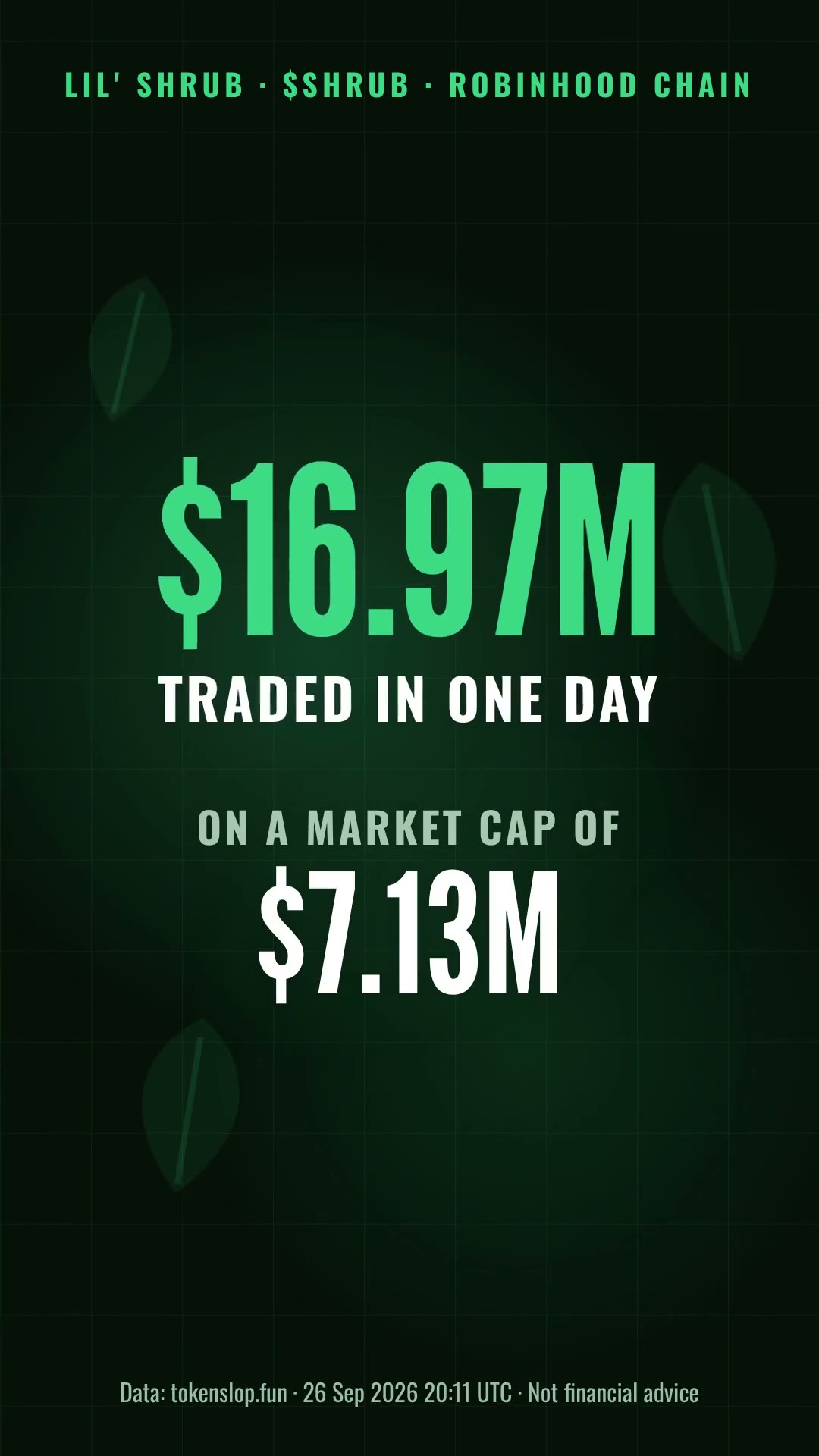
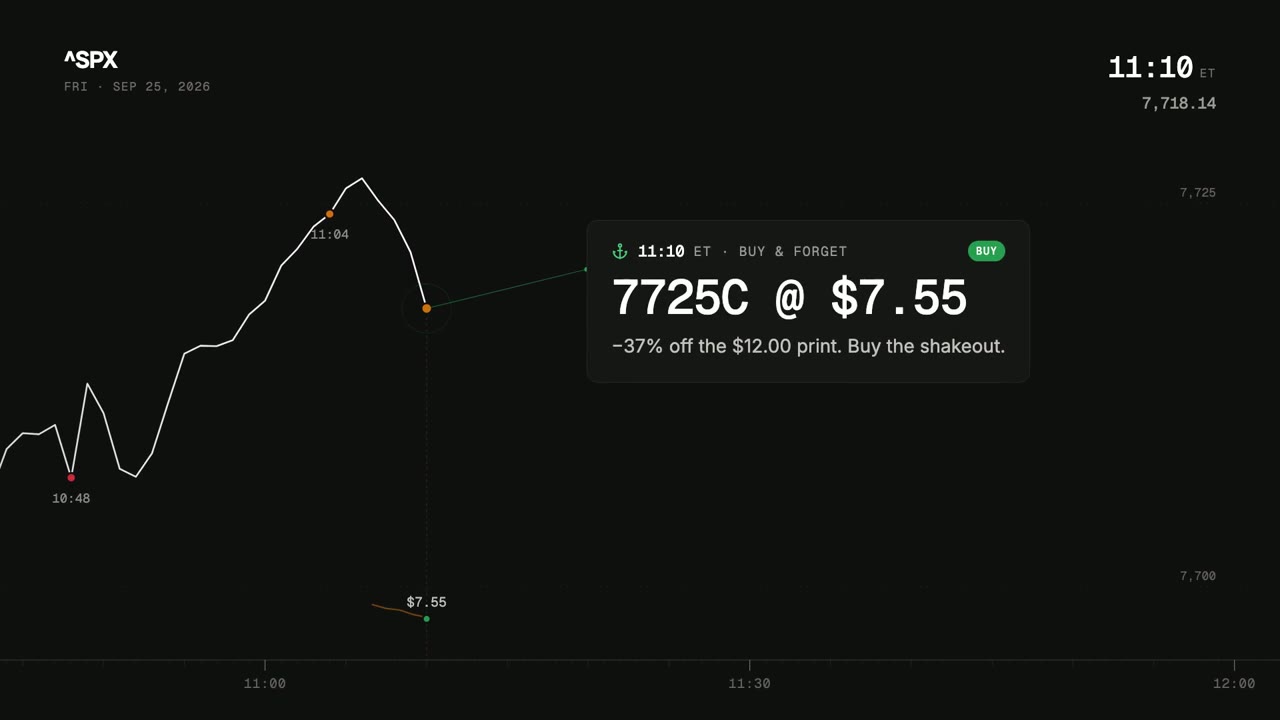
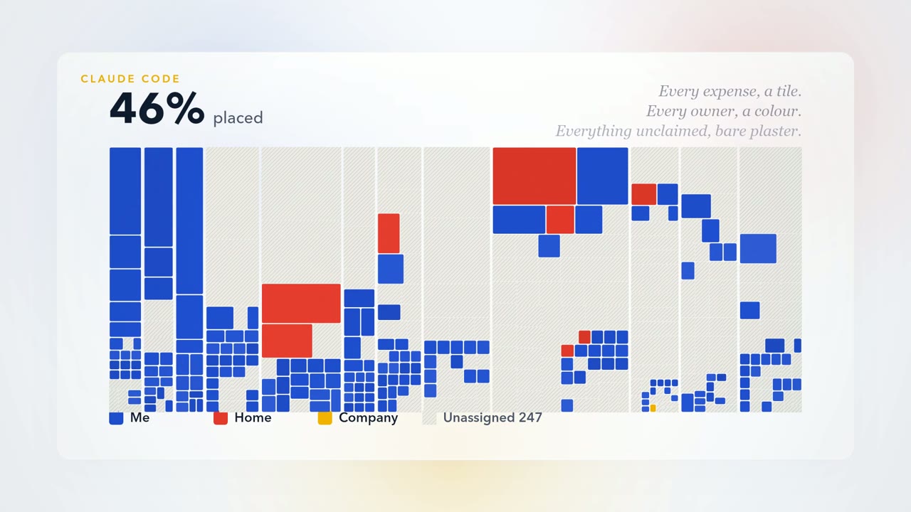
A data storytelling video is a short video that tells one data story: a title screen, a chart built from the figures and a stat that states the answer, usually with a voiceover. It turns a slide or a report finding into something people watch.
Both use the same chart and stat screens. An animated chart starts from the chart you need, while a data story starts from the question and the takeaway and uses the chart as evidence. When the chart itself is the goal, use the animated chart maker.
The numbers come from your brief: Potto draws the chart from the figures you type and does not look up or invent data. Check every number in the preview against your source before you export.
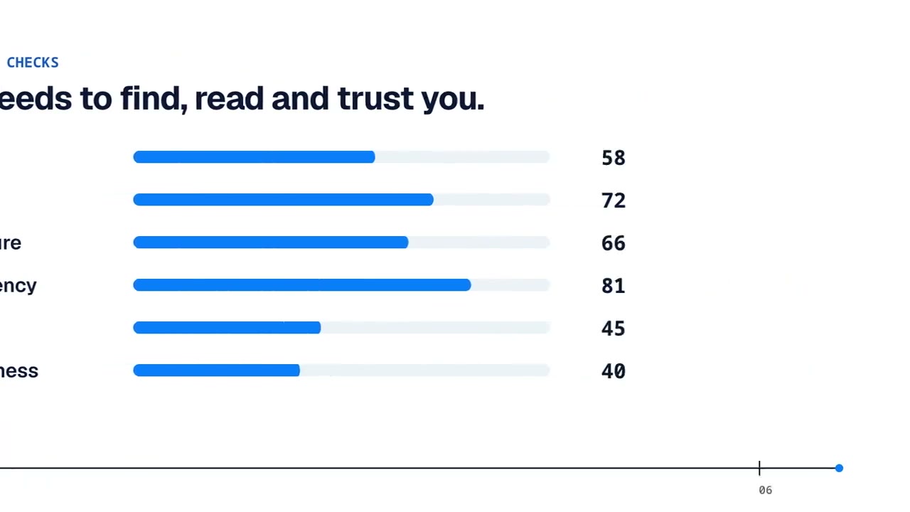
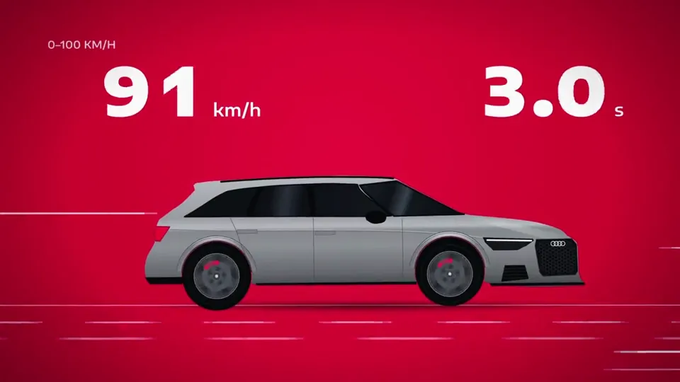
Potto’s data stories use bar charts to compare values, donut charts to show parts of a whole and large stat screens for a single number. Describe the chart you want and the AI picks the screen that fits.
Show as few numbers as the point needs: usually one chart with three to seven values and one headline stat. If you have more figures, split them into separate data stories or ask for one more chart screen, rather than crowding a single chart.
Yes. Export the video as an MP4 and insert it into Google Slides, PowerPoint or Keynote, or share it in a chat or an email. Use 16:9 for slides and turn the voiceover off if you will present it yourself.
A data storytelling video from the creator can be 15, 30, 45, 60 or 90 seconds and starts at 45.
Yes. A data storytelling video starts with a voiceover and captions, and music picked to match the style; you can turn the voiceover off or change the music.
Data storytelling videos export as MP4 in 16:9, 9:16 or 1:1.
A data storytelling video costs credits only when you export it, at 5 credits per second of video plus a few credits for the voiceover based on its length: about 75 credits for 15 seconds and 225 for 45 seconds before the voiceover. An illustration screen, if you ask the AI to add one, adds 23 credits. Previewing and editing use no credits. To start, your balance must cover the length you choose at 5 credits per second, and new accounts get 100 credits, enough to start a 15-second video.